Business Card
Design:
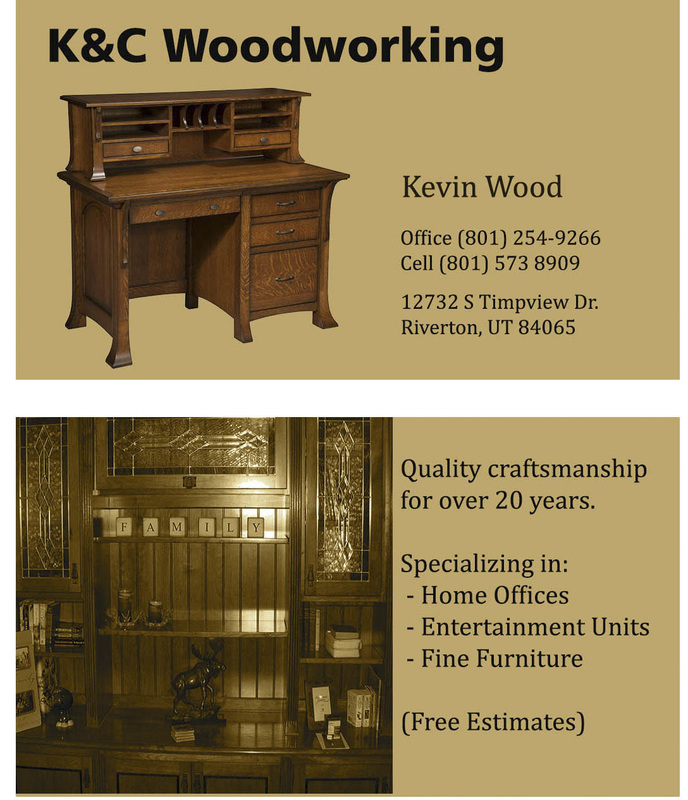
- Contrast: The photo contrasts with the lighter back ground. The lighter back ground also lets the text stand out as well.
- Repetition: The positioning of the images on each side of the card is the same as well as the font type in the “body” of the text. The design concept of the “invisible square” has been used on each side.
- Alignment: The placement of the images is aligned on the right on each side and the text is also aligned with the right edge of the invisible square.
- Proximity: The contact information is grouped together and all of the information that tells what the business does is on the back. This helps distinguish between contact and other info.
- “Artboard” was used in the layout
- Camera raw was used to enhance the images, adding contrast and intensity to clear them up a bit.
- Layers were used on each element
- Background fill was used to color the back ground a light grey.
- The gradient map adjustment layer was used to give a warmer tone and to give a feel of old world craftsmanship.
- Text tools were used in the text layers.
